

Post statistics and graphs
I finally got around to running some analysis on HY’s posts. The graphs that came out of it are pretty interesting. Click on the graphs to enlarge them, then you can actually see what I’m talking about below.

Click graph to enlarge
First, the left y-axis is mislabelled – it should be “Hundreds of words”, not thousands. Let’s start with the purple, green and grey lines. You’ll notice here that my rate of posting was most active in 2000 and it has been slowly declining since then. However, if you look at the purple line, the number of words typed over time have been mostly consistent, indicating a rise in the number of words per post (and confirmed by the blue 8 period moving average line). I put in a grey linear trendline for the purple line, showing a fairly even number of words posted, although it looks like it is starting to fall behind again.
I’m not really sure why I’ve become more verbose. One reason is probably that when I put the quicklink system in, that replaced the need to put one post per link. I also think that the past year has been characterised by large trip reports which have helped to keep the word count rolling. But anyway, at this rate, I’ll really be straining a lot to reach half a million words by Hear Ye’s 10 anniversary.

Click graph to enlarge
This graph shows which parts of the day I’m most likely to post. You can see the clear drop during 4.00am – 9.00am (sleeptime), 12.30pm – 2.30pm (lunchtime) and 7.00pm – 9.00pm (dinnertime). There’s a fairly consistent posting period throughout the afternoon, but posting is post likely to be a late night thing for me.
Where the red line is higher than the green line, the posts made tend to be shorter in length. One interesting feature is the 11.00pm – 1.00am period. Seems that I tend to have more to say just after midnight (reflective time, perhaps?).
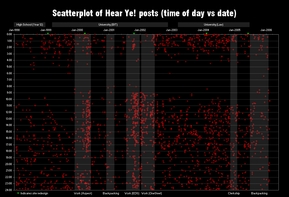
Click graph to enlarge
This is definitely the most interesting graph. Each red dot represents a post, so theoretically there should be almost 4000 dots on the graph. This graph shows when posts were made throughout the last 8 years.
I did a bit of post-production editing on this graph to highlight some interesting features that I saw. Straight away you can see a dark band through the wee hours of the morning, and I’m a little surprised to see that I’ve never made a post at 7.00am. Incidentally, you now know what time of day I’m at my worst. The biggest clumps of dots fall in early 2000, and late 2001 through to mid-2002. In January 2000, I started a full time work placement at an IT company. They didn’t give me a lot of work to do, and left me to my own devices for the most part. There’s a huge spurt of posts in March 2000, where I redesigned the site (I think mostly on company time, since there was so little work for me to do!). The exact same thing happed in late 2001. The most dense cluster is there. Incidentally, it’s also about the time September 11 happened, so the net was awash with chatter. It’s funny that most of the posts at EDS were in the morning – seems like I’d get into work and have something to say.
Ironically, the three full-time work placements on the graph coincide with the heaviest posting periods. When I went back to uni, even though I had more spare time, I wasn’t using it to post. In fact, when I moved into an apartment near uni in early 2001, there is a very quiet period for the web site. In comparison, the clerkship period (where I worked 3 days a week) around the start of 2005 shows a gap of posting during work hours. That’s pretty much the contrast in how busy I was kept in those different jobs. Now that I think about it, it would be interesting to filter out weekdays and weekends and see those posting patterns.
Each site redesign usually made it easier for me to update the site. In 1998-1999, updates were done by editing static HTML and manually FTPing the file. In early 2000, I switched to a batch FTP updater. I finally implemented a database backend in late 2001 and you can immediately see how much that facilitated posting – but funnily the effect was only temporary. In January 2004, I redid the backend, but they were mainly feature adds and tidying things up – the method of posting was still the same. Nonetheless, there’s a brief spike in posts (must have been the novelty value of having a revamped backend). Finally, in mid-2005 I redesigned the site, but there is no typical spike in posting frequency because I left the country almost straight afterwards. Questions?

You’ve fallen for the basic pitafall of using a moving average, which is basically that it exaggerates high points and undersmooths. I’d recommend a kernel function if you want a ‘statistically valid’ smoothing but here’s the basic handmade one:
http://img67.imageshack.us/my.php?image=stats15cy.jpg
Also on the 2nd graph you seem to be using Excel’s “draw smooth line” option, which should be firmly in the “never use” bucket for any kind of serious data presentation (it generates spurious peaks and troughs between points).
Also I think you missed a very interesting piece of info from your analysis which is the variability of the words per post per week. It seems to
a) be a lot more volatile now than pre-2001. What happened in 2k1?
b) have spikes in more recent times that I can’t map to eg. post frequency or one of your work stints based on the other info in those graphs. What’s driving those spikes? I feel like I’ve noticed the posts going from roughly uniform length to ‘series of short posts followed by essay’ so maybe that’s what we’re seeing on the graph.
c) It would be interesting to regress eg. post frequency on the standard deviation of words per post per week (that red line). Maybe you could even throw in a few factors and see which ones are statistically significant, which would give you some (statistically backed) insight into what is causing the changes you’ve described fairly well above.
Oops, posted a double whammy. But I cite in my defense that I got a PHP error both times that said “Notification did not send! Please let me know of this error” (followed by the bane of PHP developers, the headers already sent error).
I will defer to the actuary… I have no idea what a kernel function is, and yes I smoothed the line in the second graph because it looks prettier. Do you want the excel data to play around with? I think you actually know what you are doing :)
PHP mailer function went down on web host for a few days, it should be fixed so the “Notification did not send” error shouldn’t happen anymore.
It would be interesting … but I probably won’t have time to play around with those for a while.